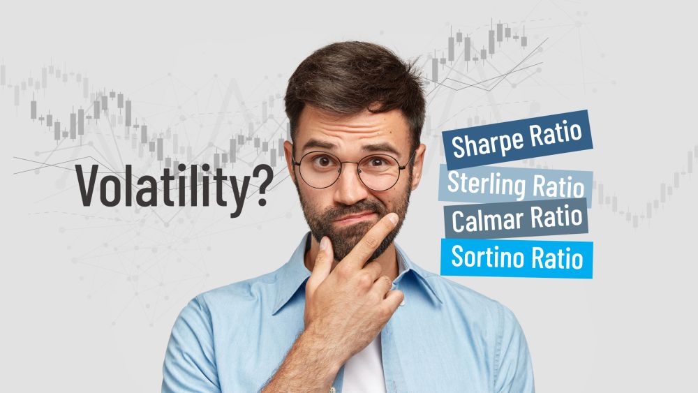
Following up on our recent blog about volatility, here are five more risk and volatility measures that you have to know to analyze stocks and strategies like a pro.
Sharpe Ratio
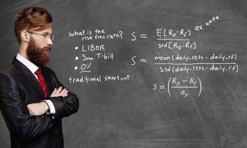
The most common – but flawed – measure of risk-adjusted performance in light of volatility. The Sharpe ratio indicates a trader’s or strategy’s return-per-unit-of-risk. “Risk” is usually defined as “standard deviation,” which, as we went through in our last blog, is a massive oversimplification. A wily trader may have a great Sharpe ratio on paper while taking wild risks every day, or vice versa.
To calculate it, take the trader’s annualized rate of return minus the rate of return on a risk–free investment (usually T-bills) divided by the trader’s annualized standard deviation.
Often cited as a measure of trading ability, a Sharpe ratio greater than 1 is considered good performance. Basically, that means that for every unit of risk a trader took on, they were able to generate an equal amount of return. But risk is never that simple – and the Sharpe ratio gives people more false confidence than information. We even wrote an entire blog about how misleading it can be.
Sortino Ratio
The Sortino ratio is also used to quantify risk vs. reward. It only considers the trader’s or strategy’s downside deviation (negative returns) instead of their standard deviation, which includes both positive and negative returns. Similar to the Sharpe ratio, larger numbers are better, implying that whenever a trader took on more downside risk, they were able to produce a greater return to make up for it.
Sterling Ratio
In an attempt to better grasp the vague idea of “volatility,” the Sterling ratio is a bit more convoluted. It’s calculated by taking the annualized return over the last 3 years, divided by the average maximum drawdown over the last 3 years minus 10%. It assumes that a single year’s maximum drawdown doesn’t tell you enough, and averages that calculation over 3 years, with a completely arbitrary -10% thrown in for little reason beyond making the function work; if there were no drawdowns over 3 years, then that would mean you’re dividing by 0, which gets you nowhere. Best to leave the Sterling ratio in the past and stick to its more useful cousin, the Calmar ratio.
Calmar Ratio
The Calmar ratio is similar to the Sterling ratio because it takes the 3-year annualized compounded rate of return minus the risk-free rate of return and divides that by the 3-year average maximum drawdown. It’s a bit of a combination of the Sharpe and Sterling ratios, telling you a bit about how a trader or strategy performed in light of the maximum drawdowns they endured. We like that it uses a 3-year average, which tells you a bit more than the Sharpe ratio, but it should still be just one tool you use to assess risk and performance.
Volatility? The Pain Index
Easily the most aptly named of the group, the Pain Index is good for one thing and one thing only: avoiding losses. It doesn’t measure volatility in any sort of objective sense. It’s sole purpose is capital preservation, and the enemy of preservation is loss. Specifically, it measures how deep, how long, and how often losses occur over a defined time period: frequency, duration and depth. It aims to measure the area on a price chart in which drawdowns occur. This should be causing flashbacks for those of you who took Calculus I. By finding the area under a line, it’s giving you a better idea of how “bad” drawdowns were – something that the ratios above really don’t do. For investors concerned about losing any money for any length of time, this can be very valuable information indeed.
If trading in a volatile market has you scratching your head, check out fractalerts. Find out how fractalerts can simplify your trading at our Get Started page.
-

The rhytm beneath the noise
-

You Don’t Need a Trading Style. You Need an Edge.
-

Consistency Isn’t the Goal—It’s the Outcome
-

What 2 Quadrillion Data Points Told Us
-

Math and Physics-Based Trading in Any Market Condition
-

Do not worry about anomalies
-

Consistency should not be the goal. Consistency should be the result.
-

Stop canceling fridays
-

The Elliott Wave Forecast is Subjective, Bias Driven And Backwards looking
-

Finding patterns in market data

